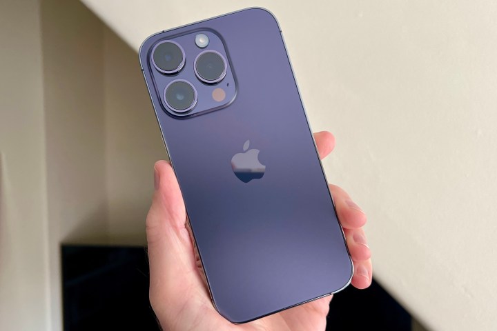
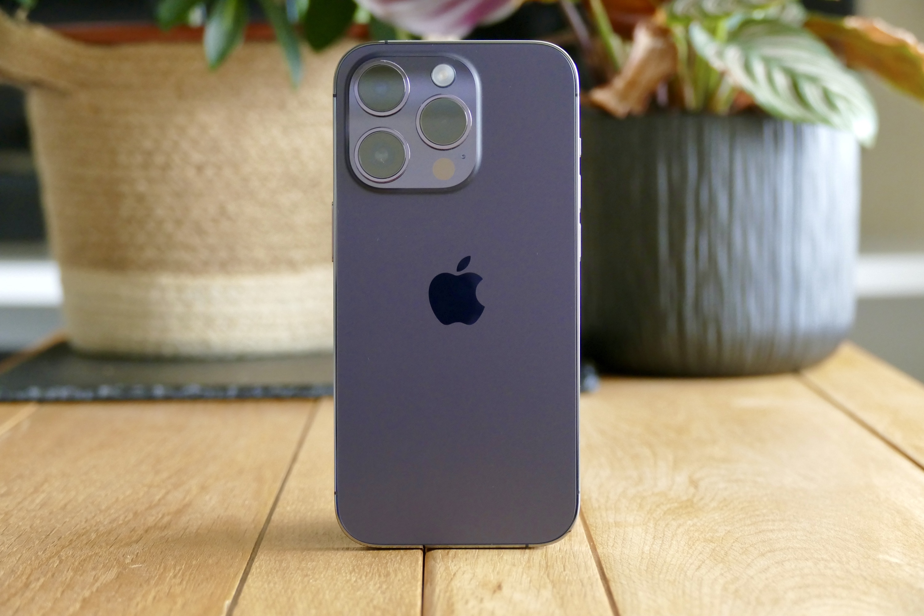
I was one of the few million users who upgraded to the iPhone 14 Pro during its first month of availability. The new 48MP camera, Dynamic Island, always-on display, and more combine to make it a compelling purchase over the iPhone 14 — which, in my opinion, doesn’t really justify the $100 increase over the $699 iPhone 13.
Like many buyers, I upgraded from an iPhone that didn’t have any of the three aforementioned features, thinking that they’d make for an interesting product. But after a few weeks of use, I have come to terms with the fact that iPhone 14 Pro is my most regretted purchase in the past few years. Here’s why.
Dynamic Island doesn’t add anything new to the game
“Meet the new face of iPhone,” reads the Apple website while describing the new cutout on top of the iPhone 14 Pro that eliminates the notch. Apple is pushing the Dynamic Island as its way of “multitasking” on an iPhone. After all, the website says, “it [Dynamic Island] bubbles up music, sports scores, FaceTime, and so much more — all without taking you away from what you’re doing.” It’s an interesting way of doing things, surely. But it isn’t the game-changing feature the Apple marketing team wants you to believe.
The Dynamic Island doesn’t bring much to the table. It’s a new interface, yes, but it doesn’t do anything that wasn’t possible before. Tap and hold it to play/pause music or change tracks – I could do that by swiping down from the top of the screen. And with iOS 16, I prefer swiping down to control my music because the widget is now at the bottom, unlike Dynamic Island, where I have to reach to the top by adjusting my phone grip.
As I’ve written before, the Dynamic Island isn’t very dynamic most of the time. As a result, it’s just a big cutout placed lower than the notch that makes it eat up space when you are watching wider aspect ratio videos on YouTube or any other app. And don’t you fill your screen with the video, else you’ll be left with an ugly cutout right in your viewing experience. I hope the Dynamic Island changes in the future as developers update their apps to work with it. But as it stands right now, the Dynamic Island is distracting in a way the notch never was.
My battery anxiety is back

A few months ago, I wrote how the iPhone 13 Pro Max (my previous phone) helped me cure my battery anxiety. But it seems like I’m back to my old power bank days with the iPhone 14 Pro.
Before you pounce on me with the argument “most users would be upgrading from the iPhone 12 or before,” that is no excuse for poor battery life. I bought the iPhone 14 Pro to mostly write about it and the new features, but when I end up charging it twice a day, there’s not much I can test when outside.
In my usage, LTE drains battery life like crazy. Five minutes of camera use with LTE on and photo sharing on WhatsApp dropped the battery from 29% to 22%. I’m not used to it as someone who has been daily-driving the iPhone 13 Pro Max with stellar battery life for the past few months.
Some say the battery drain could be a result of iOS 16. And it really could be. I also updated my iPhone 13 Pro Max on the latest software and it isn’t lasting me as long as it did before — but it could still see me through a day of usage easily. A bigger battery helps, sure, but I expect better battery life from a $1000 smartphone in 2022. And if it’s a software issue, I expect a company of Apple’s stature to fix the problem within a couple of weeks of launch, and that hasn’t happened yet.

The iPhone 14 Pro’s battery life reminds me of Galaxy S22 Ultra’s battery life, which couldn’t last me a day if I was using all the features given to me. The always-on screen and haptic feedback on the keyboard are draining the battery life of my iPhone 14 Pro. The new features don’t seem to be optimized for the latest Apple phone, and it shows.
The only new feature I’m liking is the always-on display. I have a dark background, so it isn’t as bright for me as some are claiming it to be on social media. It works for me. But the battery drain is real, which forces me to turn off the feature.
More megapixels, but for what?
A 48MP camera sounds like a good upgrade from a 12MP camera system on paper. But in reality, it doesn’t translate to having an impact on the average Joe, since the iPhone 14 Pro clicks similar photos as my iPhone 13 Pro Max. Sometimes, the dynamic range goes for a toss or the Portrait mode doesn’t get edge detection right.
The above images were shot at sunset. While the iPhone 14 Pro focused on the setting sun sky, the Galaxy S22 Ultra also exposed the subject clearly while maintaining the sky colors. The image shot on the iPhone lacks the yellow color saturation on the flowers. It doesn’t expose the subject clearly. And this isn’t a new issue, it has been this way for quite some time now. I hoped the new camera sensor would improve things, but in my experience, it hasn’t.
I hoped for a better experience

In my experience with the iPhone 14 Pro, Apple has dropped the ball on battery life and camera, while also introducing an all-new look with the Dynamic Island, which doesn’t make for a better viewing experience. When I first bought the phone, I expected it to last me an entire day, but it doesn’t. I expected the new Dynamic Island to enhance my usage experience, but it didn’t. I also expected the cameras to be better than my iPhone 13 Pro Max, but they aren’t.
The trio of issues doesn’t give me much confidence to keep my iPhone 14 Pro, I might end up selling it within a few weeks of purchase because my experience has been underwhelming. I’ll gladly go back to my iPhone 13 Pro Max, which would last me all day without compromising on cameras. I can live without an always-on display if my battery anxiety is taken care of.
Editors’ Recommendations


